
I’ve been working on the first custom piece for OBT. While we were on site, we took pictures of the color boards the interior designer selected for each floor.  This first piece is for the 1st floor. Now, I must admit here that I am not a big fan of matching artwork to the color of the walls or sofa or carpet, so I am actually using the color palette as inspiration NOT a template. I think creativity can be stifled when we try to control too much of the process. So to the left is a shot of the color board.
The basic walls are shades of white a beige – or whatever color the paint company named that shade of beige. And accent walls show in the upper left corner – a shade of blue and some sort of taupe or darker, neutral beige. Not the most exciting colors, but a start. Notice that the carpets are blues and greys, and the rest is very neutral.
So time to see what will inspire me. I went to the drawers and bins to see what I could find. Here is where I started.  To the right are the blues from my scrap box that I chose to get started. They are mostly Japanese scraps we bought while in Tokyo and Yokohama Japan. I like how they compliment the accent blue on the paint sample and seem to blend with the blues in the carpet samples. But blue was not the only color I chose to use, so here are the other bins I opened to see what I could find.
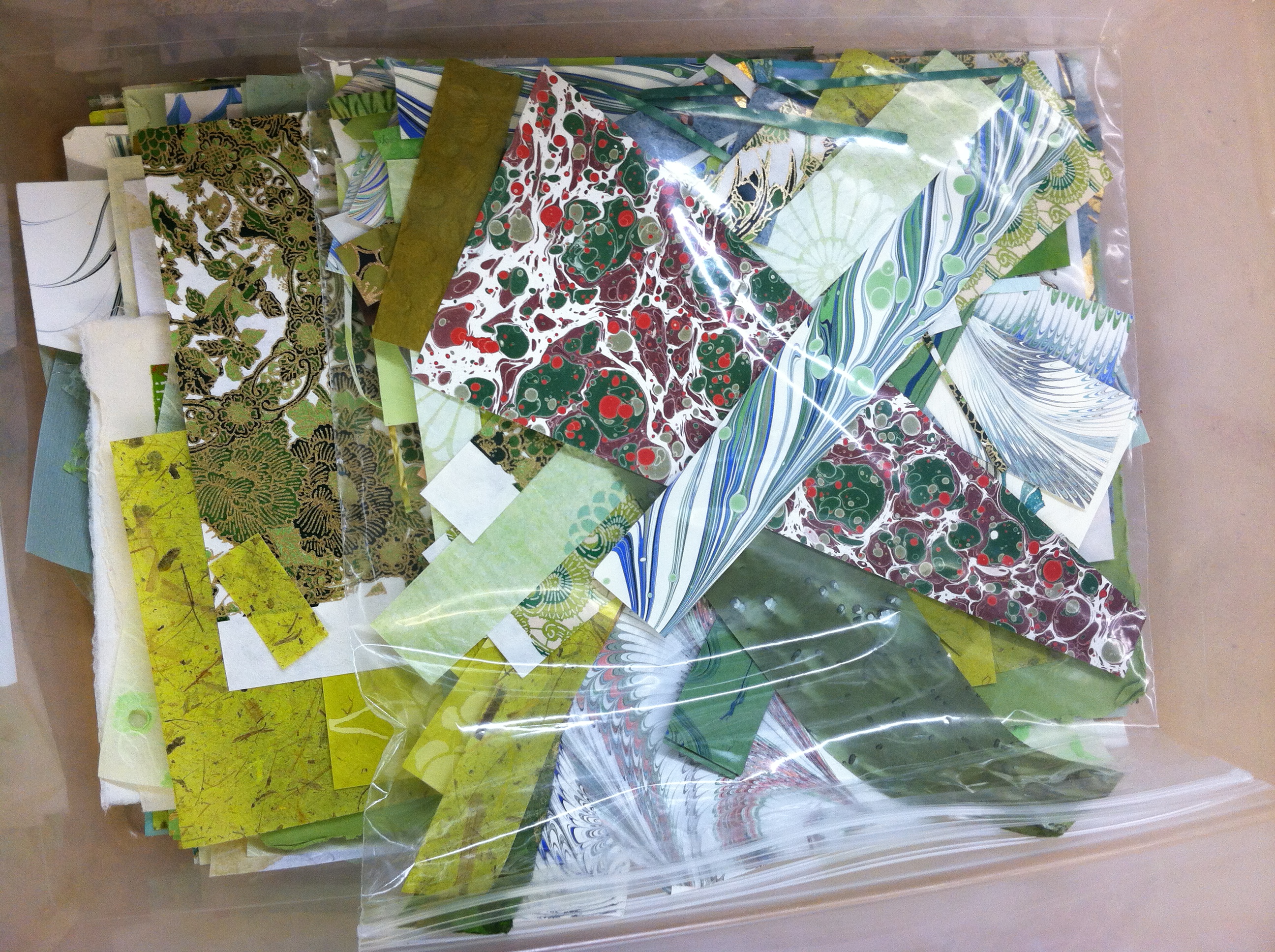 I moved into the light green box and found a great deal of marbelized paper made by my friend Mimi Schleicher. She is considered one of the premier marbelizers in the country. I am including a link of her marbelizing from YouTube (http://www.youtube.com/watch?v=jlRulPWPZ6g) Just in case you want to see how marbelizing is done. Her papers are all handmade and copyrighted for her designs.
And then one more unexpected color, orange and maybe a bit of yellow. As you probabaly know, orange is the compliment of blue. 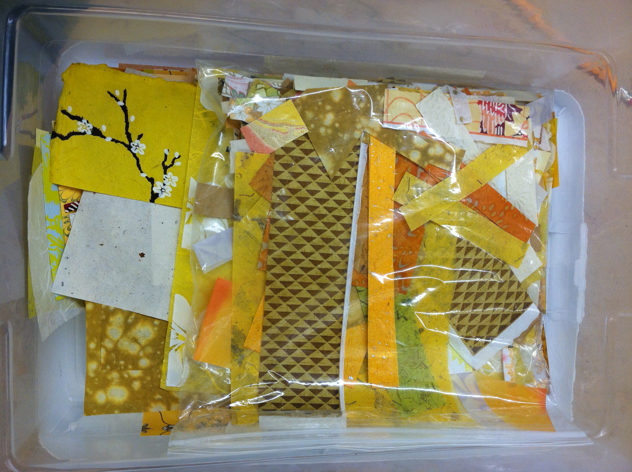 So I picked this one to add a little pizzaz to the piece. I wanted something to grab the viewer’s eye and draw them closer to the frame. I think orange and shades of yellow will do that quite nicely.
So here are pieces from each box pulled onto the table in one place.  In this shot you can see all the colors on top of each other, in their random order with no one color highlighted over another. The interesting challenge for me is to figure out the pattern and frequency with which I will use each color and individual piece of paper or scrap. Hopefully you can see the possibilities like I could once I pulled it all onto the table.
I’m going to stop here, to leave you wanting more. I have finished this mat and will move onto the calligraphy for the center of the piece.
My next post will walk you through the second piece and color selections for the second floor of the center.
If you think about it, let me know your thoughts on my color choices.

BLESS YOUR HEART! I did not know you intended to do more than one creation! I love your choices and can’t wait to see how they are put together. love phyl
LikeLike
I am blown away by the love and thought you are putting into creating the works of art for the walls in our OBT. Although I am an independent resident, I can’t wait to visit and see the finished product. Thank you so very much for your “loving kindness”. I really like the colors you have chose
LikeLike